


Introduction
Marquees were a structural element that always confused me. I could see them working but wasn't able to figure out why they behaved as they did.
In this article, I'll be going over a common infinite looping marquee implementation in CSS, explaining how it works in incremental steps.
Omitting the code implementation, which can be easily accessed online, I will refrain from delving into the nitty-gritty technical details within this context.
Translations in CSS
Before we move on to the marquee implementation, it is essential to understand how translations in CSS work.
Translations in CSS refer to moving elements in the horizontal or vertical direction without changing their size, shape, or orientation. This is accomplished using the transform property with the translate() , translateX() or translateY() function
div {
    transform: translate(20%, 20%);
}
translate()
This function takes two values as arguments:
the first for horizontal movement (positive values move elements to the right, negative values move elements to the left)
the second for vertical movement (positive values move elements down, negative values move elements up).
translateX()
Similar to translate(), but only permits horizontal movements. It takes one argument corresponding to that.
translateY()
Similar to translate(), but only permits vertical movements. It takes one argument corresponding to that.
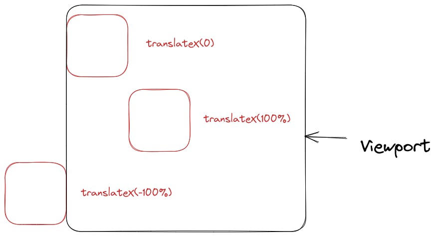
The fixed units (em and px) as well as viewport units (vw and vh) work as usual.
The unexpected behaviour occurs when percentages are used. They are relative to the element dimensions, not to the page dimensions.
Here is an image demonstrating it.
Setup for Infinite Looping
We require to have a marquee in which a sequence of images loops infinitely.
It is important to keep in mind that it makes more sense to make a marquee out of the images only if the combined width of the images is more than the width of the viewport.
Otherwise, that would be one pointless marquee...
Here is an illustration of the images in our marquee being placed in the viewport with no dynamic behaviour.
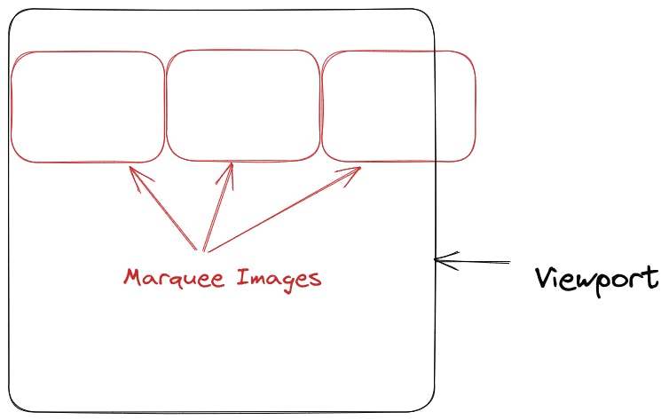
In this setup, there would be a lot of white space that trails the last element until it gets to the edge of the screen.
To make the marquee look like it's repeating, we'll be using two identical marquees that are placed in a container that is NON-statically positioned, to achieve this.
The importance of the container being NON-statically positioned needs an understanding of how absolute positioning of elements with manual insets works.
Here are a few reference links:
This is our new setup with the container of the second set of images being `absolute`-ly positioned with an inset value of top: 0 so that it overlaps with the container of the first set of images.
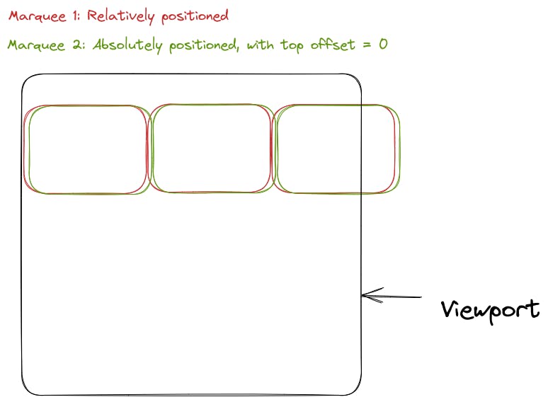
Note: These two marquees are exactly overlapping. The slight displacement is for making it clear that there are two of them.
Making the Animation Work
We will be applying two separate animations for the two marquees.
Assuming this to be the basic markup for the marquee element:
<section>
    <div class="marquee-common marquee-1">
        ... <!-- Images placed inside here -->
    </div>
    <div class="marquee-common marquee-2">
        ... <!-- Images placed inside here -->
    </div>
</section>
We'll be making use of keyframe animations in the CSS rules for this marquee:
.marquee-common {
    ... /* Common styling for both the elements */
}
.marquee-1 {
    animation: marqueeOneAnimation 25s linear infinite;
}
.marquee-2 {
    animation: marqueeTwoAnimation 25s linear infinite;
}

@keyframes marqueeOneAnimation {
  from {
    transform: translateX(0%);
   }
  to {
    transform: translateX(-100%);
  }
}
@keyframes marqueeTwoAnimation {
  from {
    transform: translateX(100%);
   }
  to {
    transform: translateX(0%);
  }
}
These animations are starting in parallel without any delays, so the from and to states of both the keyframes will be reached in sync.
Note: These values are for a left-moving marquee.
Thinking intuitively, just change the signs of the translation values for a right-moving marque.
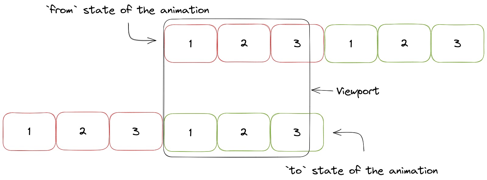
from or Starting State
Marquee 1 is translated by 0, so its images, starting from the first one are visible.
Marquee 2 is translated to the right (along the X-axis) by 100% of its width, effectively removing its overlap with Marquee 1.
This difference in translation is kept constant throughout the two animations to prevent any overlap from occurring.
to or Ending State
Marquee 1 is translated by 100% of its width to the right, so none of its images is visible.
Marquee 2 is translated by 0 so it is where Marquee 1 was at initially.
Visualizing the Animation Logic
From the User's Eyes
Since the animations are run infinitely, the marquees would snap back to the starting state at the end of the animation, without any delay.
If you take a look at the starting state of the animation, the image numbers are the same as the ending state, even though the actual marquee element being displayed is different.
However, since the two elements are identical, there is no visual interference for the end user when the marquee runs. The end-user will only see a horizontal scroll of a collection of images.
Wrapping Up
In this article, we've gone over the basics of how translations work in CSS and how they can be used to create an infinite looping marquee for a sequence of images.
We've also taken a look at the logic behind how the marquee appears to endlessly scroll, without any breaks in between.
I hope this article has helped you understand the mechanics of marquee effects and I believe the next time you'll have to implement one, you'll have confidence in your understanding of how it works behind the scenes.
Thank you for reading!